Cyanotypes
|
Anna Atkins
Anna Atkins was born on the 16th of march 1799 and died on 9th june 1871. Anna studied flowers and was also a photographer 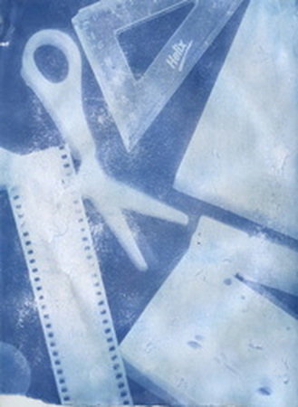
|

|
|
Image 1:
This image didn't work well because I didn't leave it out in the sun as long as i should have. Although the composition is similar the shapes have a less striking opacity. Other parts of the composition I don't like are how parts of the blue has blotches of white so its not as defined as my preferred image. |
Image 2:
I like this image because it has a good composition as all the items in the photo have a good spacing and fill the paper nicely. I really like the texture of the circles and how the lines of the image have come through. If I was to change any thing I would put more items on the photo but with different opacity. |
